- Mobile app
- UI and UX design
- Research
Tabbe
A mobile app that puts currency transfers and bill splitting in one place, so a night out takes one app instead of several.
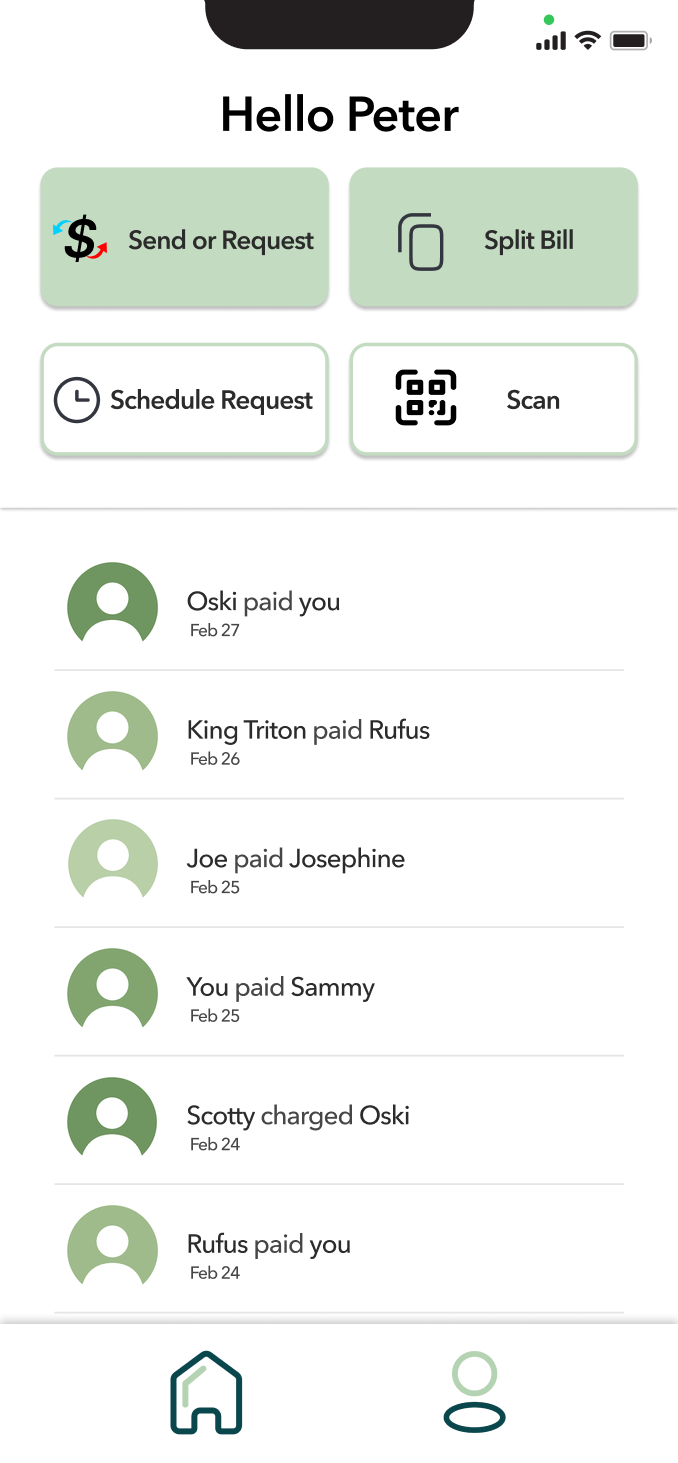
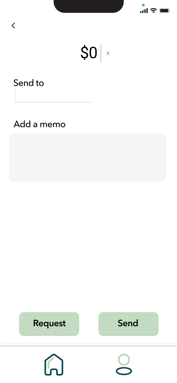
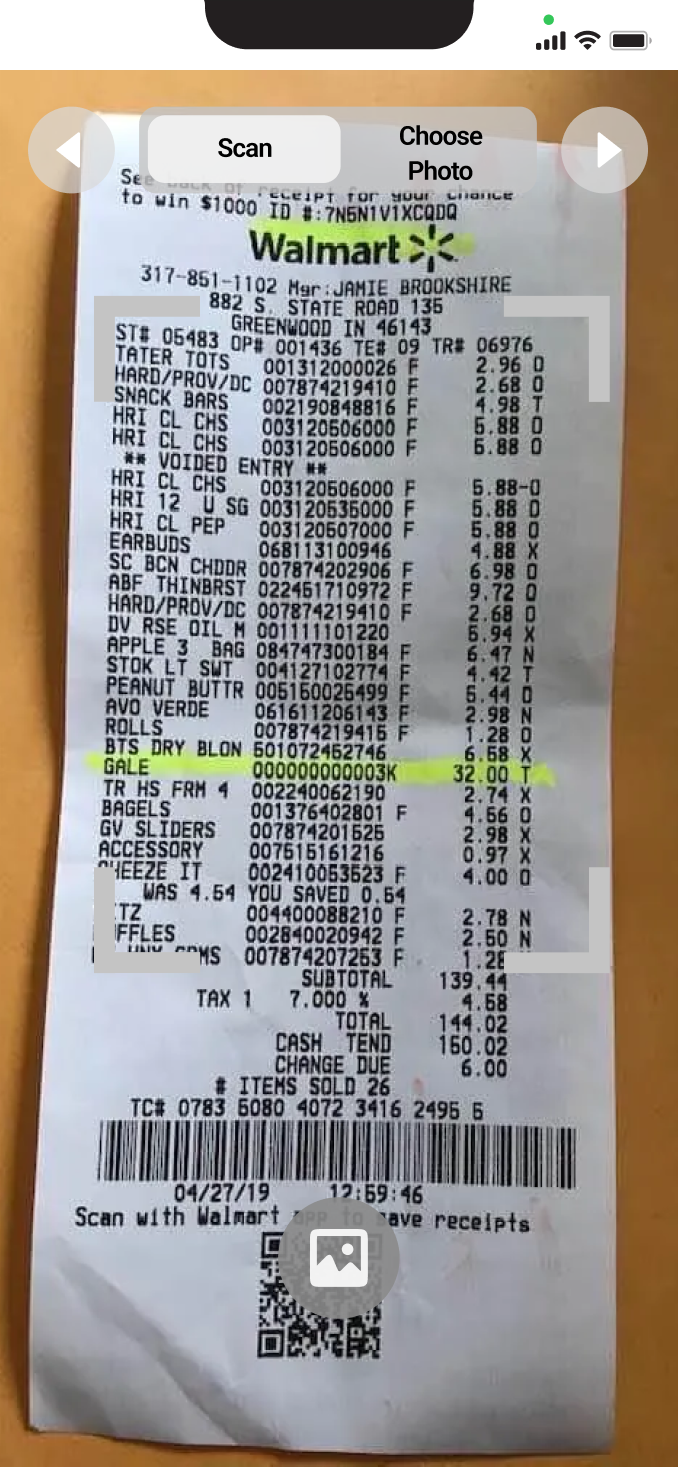
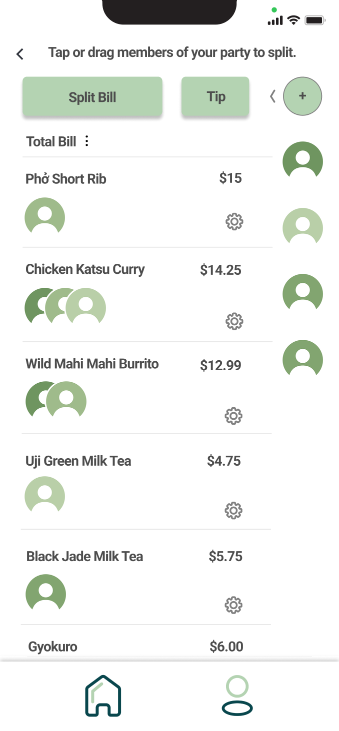
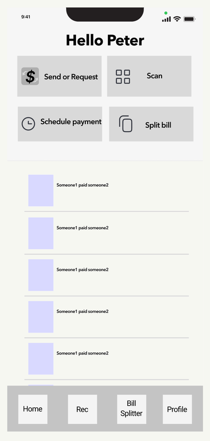
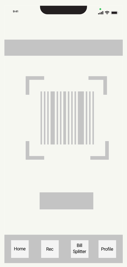
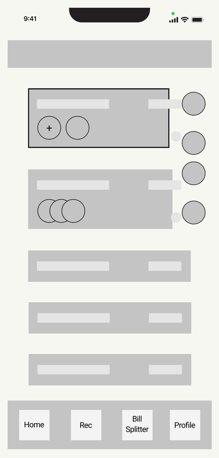
Four screens, one night out
Screens of the app's features, used in user testing.
One night out shouldn't take several apps.
A night out usually means juggling apps, from planning the evening to paying for it. That split makes a simple outing harder than it needs to be.
Too many apps
Many people disliked needing several apps for a simple dinner out.
Small frustrations
Many had trouble with an app, or wished one feature worked differently.
A narrower focus
Testing and mentor advice pointed us to transfers and bill splitting.
Research
We ran interviews and surveys with approximately 20 to 30 users, mostly peers, who use PayPal, Venmo, Tab, and Splitwise. All four are popular, and users still ran into trouble, either with how the apps look or with how they work.
Who we talked to
- Methods
- Interviews and surveys
- People
- Approximately 20 to 30, mostly peers
- Apps they used
- PayPal, Venmo, Tab, Splitwise
- Trouble with
- How the apps look, and how they work
Narrowing the focus
After user testing and advice from our mentors, we narrowed the product to currency transfers and bill splitting. A focused product gave our pitch a clearer story and gave us a sharper experience to refine.
Restaurant recommendations and reviews were on the roadmap for later.
Design
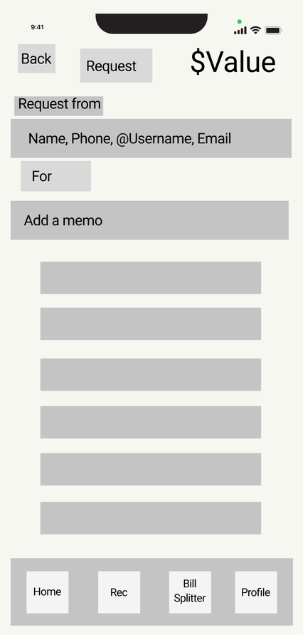
I took cues from Tab and Venmo and wrote down the specific problems users described with each. The wireframes aim to fix those problems directly.
What I learned
The business side. I learned how it fits around the product: market research, the regulatory requirements for peer-to-peer payments, and preparing for a business competition.
Wearing several hats. As the only designer, I covered market research, UX research, UI design, and graphic design. It made me a more versatile designer and a clearer communicator across disciplines.
Tabbe was our entry in the UCI business competition. We didn't win, and with no funding and little free time, we closed the project. It gave me a full start-to-pitch run at building a product.