- Nonprofit client
- Design leadership
- Responsive web
No Code for All
A resource hub that helps nonprofits build and manage their organizations without writing code.
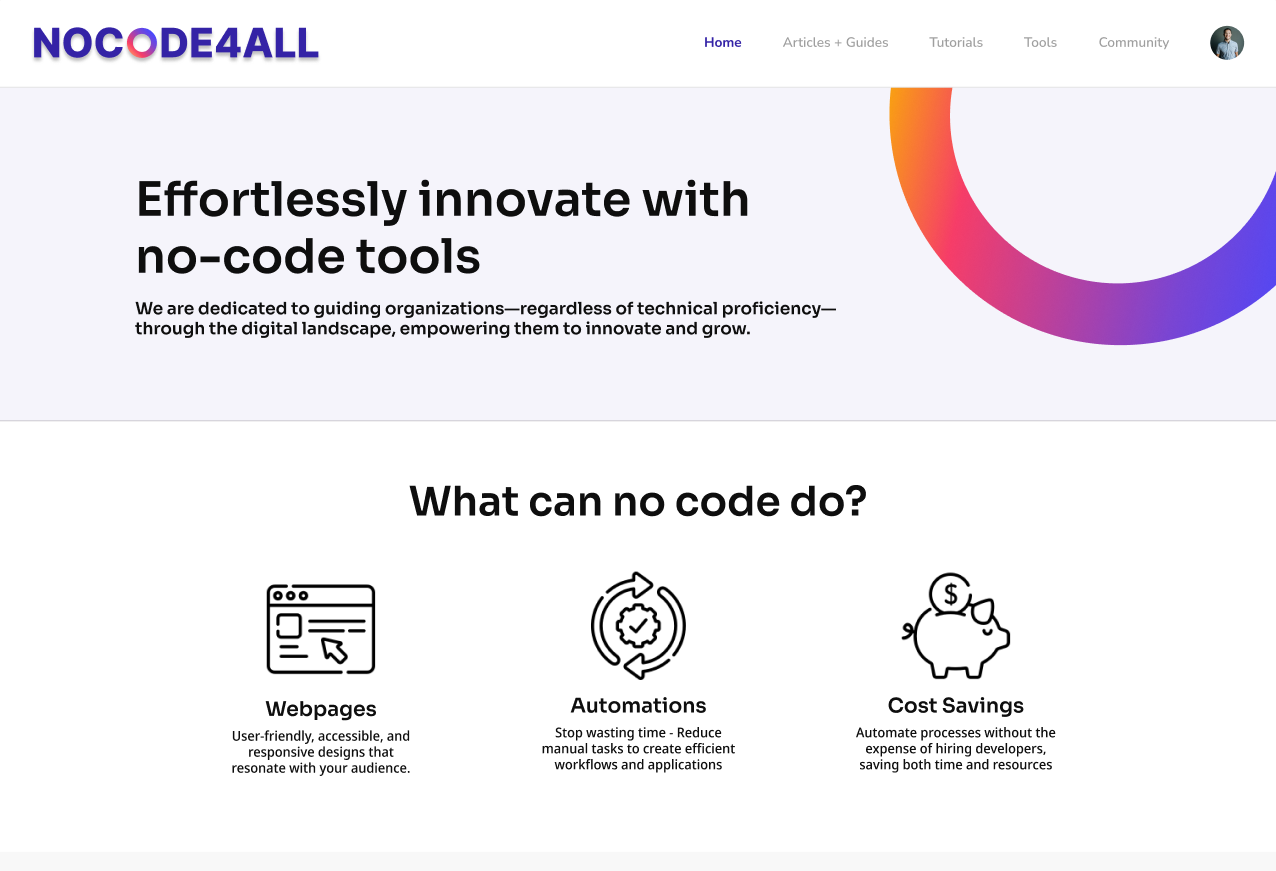
Many nonprofits stall before they start.
No Code for All exists to lower that wall with website builders, automation guides, and other tools that need no code. The client asked us to design the site, and to design it so his own team could manage it afterward.
Missing tools
They lack the knowledge and tools to set up a stable organization.
A coding wall
Coding is a wall for people who've never tried it.
Built for handoff
The client's own team had to run the site afterward.
Research
Literature review. Nonprofits face tight budgets, aging technology, and little IT support. Even so, many have used no-code tools to improve donor and volunteer management and day-to-day programs. The need is real and the tools work. They just aren't easy to find and learn.
Market analysis. We studied Looppanel, NoCode.Tech, Thunkable, NoCode Institute, Xelence, and Nocode HQ. They do well on learning resources, friendly interfaces, and community. They struggle with content that's hard to navigate, little guidance on using the tools, mobile-only access, dated interfaces, steep learning curves, unclear pricing, and too much reliance on video tutorials.
What we found
- Literature
- Limited funds and lack of IT support
- Literature
- Community is essential for successful tech adoption
- Literature
- Requires a cultural shift to move away from tech
- Market
- Corroborated lack of information on the limitations of no-code
- Market
- Problem-oriented approach
- Market
- Interested in filtering solutions by price and limitations
Design
We started with the homepage, since the client wanted it to be right. After a sitemap and design system, we built a low-fidelity prototype to settle structure: a table of contents, a search bar, testimonials. We made several versions of each page and tested them to find the best layouts.
In medium fidelity we brought in the color palette and moved to warmer oranges and pinks for a cozier feel. We also redesigned search and filtering to match patterns people already know from blogs.
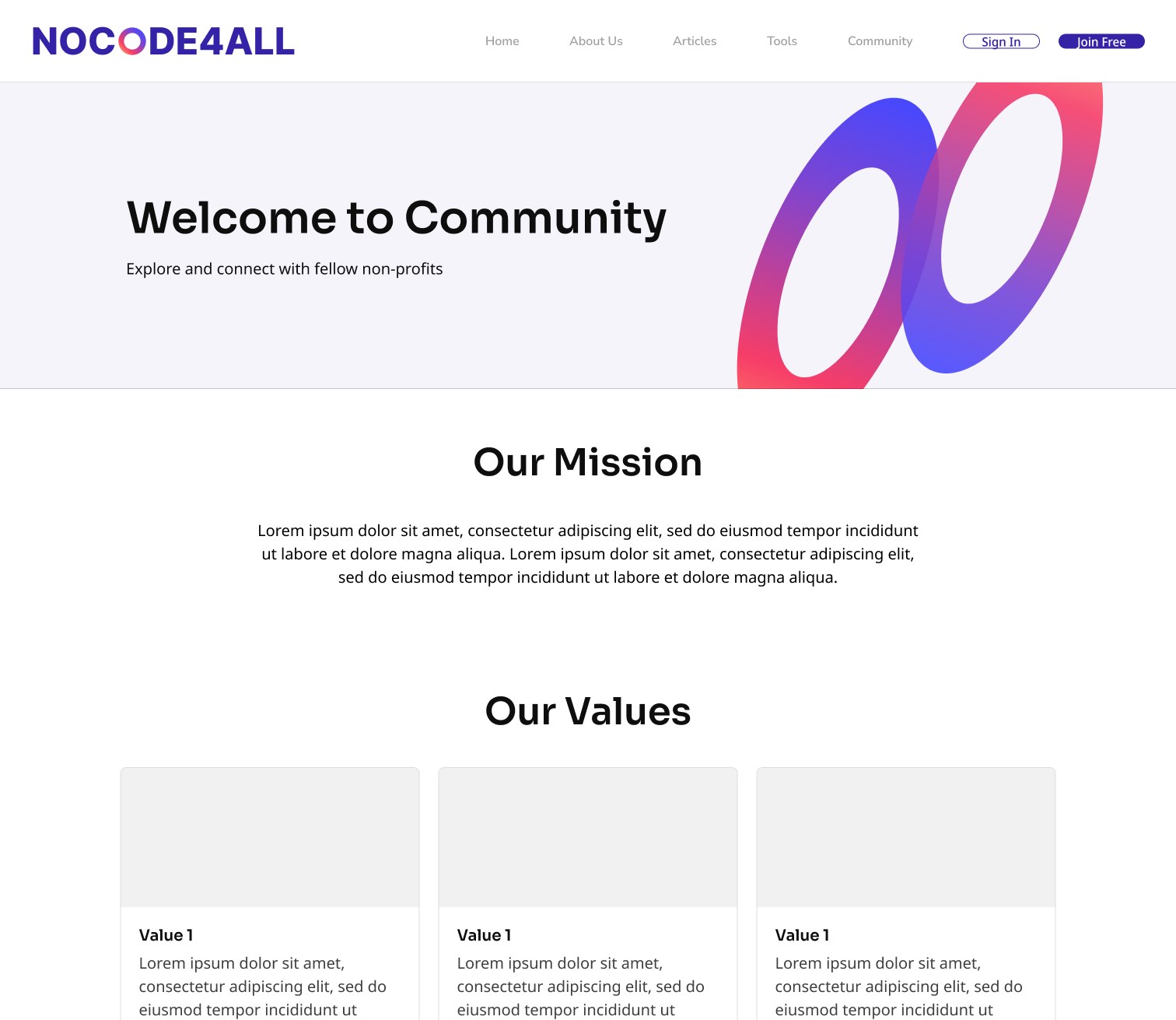
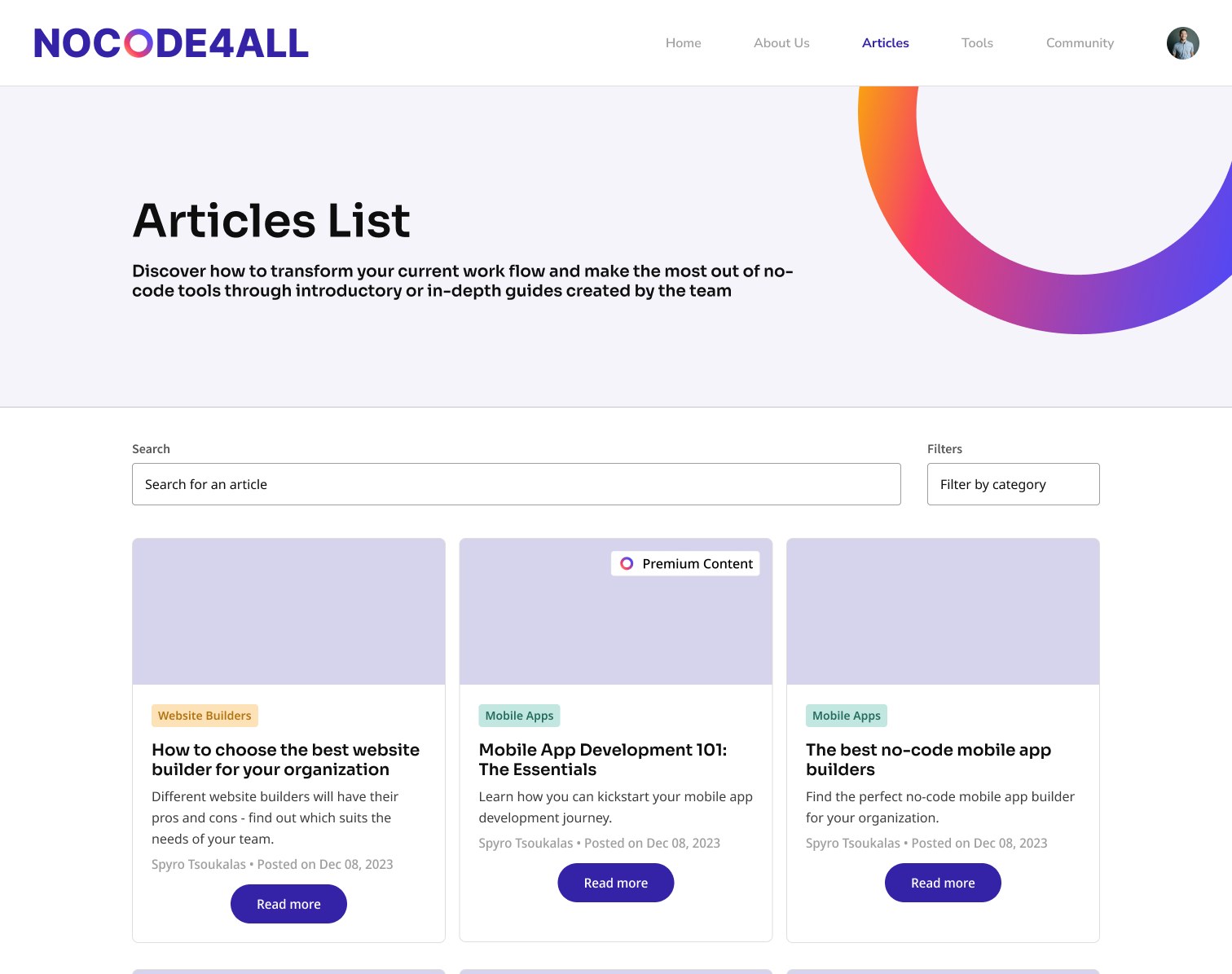
High-fidelity prototype
The finished design lets people search and filter learning content, manage a profile and subscription plan in a few clicks, and browse a directory of recommended no-code tools. Here are three short walkthroughs of the prototype.
What testing changed
We tested the high-fidelity prototype with users and made three changes.
- Tutorials and articles now live apart, so people can find the format they want.
- Every tool in the directory has a rating.
- "Who We Support" moved to the homepage, to put the community up front.
What I learned
Leading designers. I took over the lead role a month into the project. I got up to speed on the team's progress, scheduled working sessions, and kept everyone on track with weekly sprints, standups, and a task board while still doing my own design work. We launched the site on time.
Working with a client. With the product manager, I was the client's main contact. I learned to set expectations early and check our work against what he needed.