- Accessibility
- Concept
- Desktop app
Discord font accessibility
A concept for letting people choose the typeface they read in, so a font change doesn't shut anyone out.
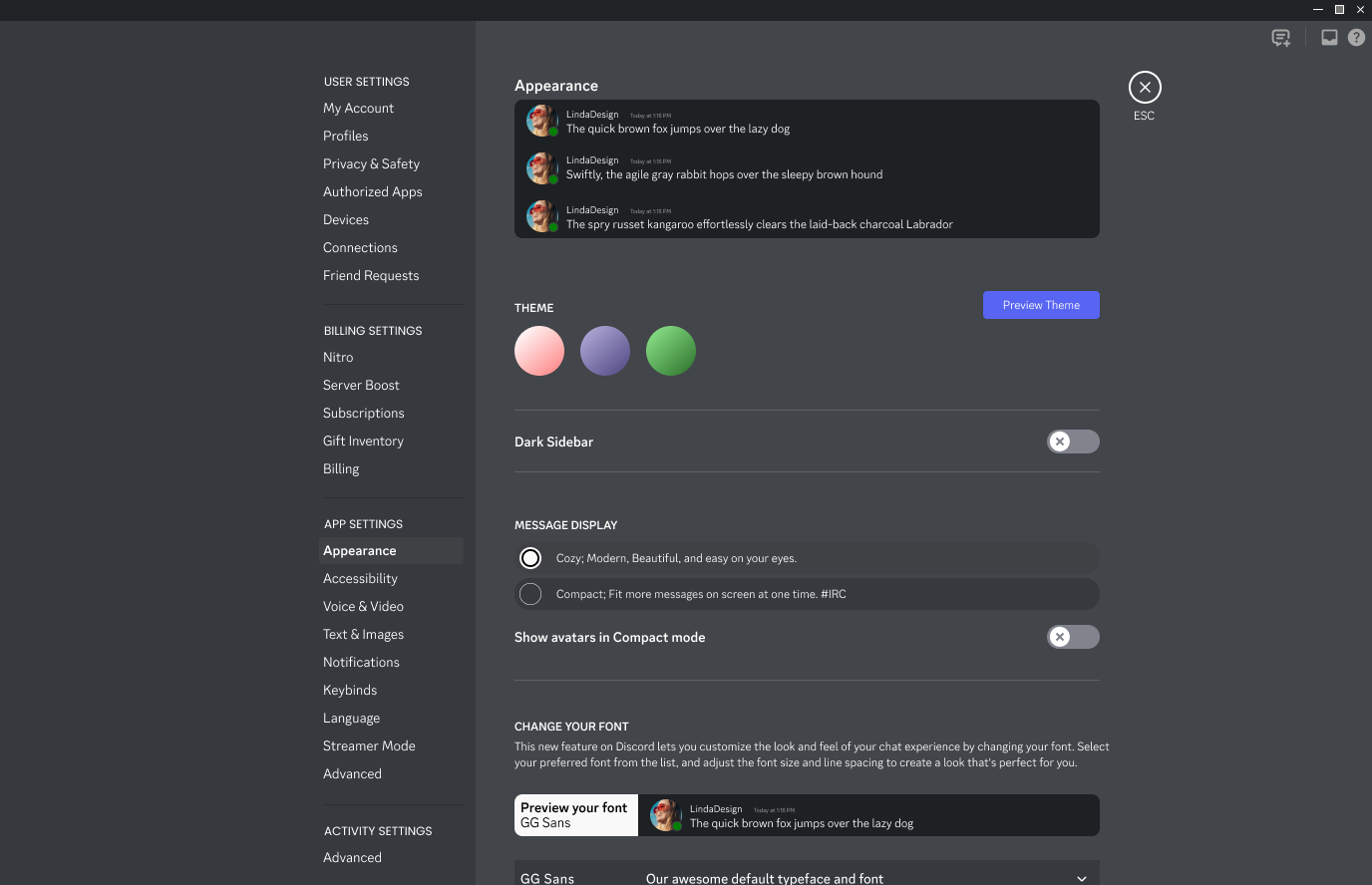
A font change shouldn't shut anyone out.
Discord moved from the Whitney font to GG Sans. For people with visual impairments, including astigmatism and dyslexia, the typeface they read in can decide whether text is comfortable or hard to read. The change left some of those users struggling to read the app.
The change
Discord moved from Whitney to GG Sans.
Who it hit
People with astigmatism, dyslexia, and other vision issues.
No way back
Some were left struggling to read the app.
Research
We read through user feedback to find pain points, then ran brainstorming sessions on solutions. Comments about readability kept coming back, especially from people with vision issues. I also ran a heuristic evaluation of Discord's interface on my own and found gaps in legibility and font choice.
The pain points became "How Might We" questions, each of us writing our own. One open question was how many fonts to offer: a long list like Google Fonts has, or 20 to 25 popular, readable ones to choose from.
Pain Points
Creates a lack of trust in the Discord brand and company
Users are having to find other, more complicated methods to revert their fonts to other ones
Users with vision issues are met with disappointment if the new GG Sans font is blurry and unreadable
Users are forced to spend their own time fixing their fonts
Faithful and longterm users may feel like this change was forced on them, and they have no voice to say otherwise
Users are not able to find settings to make font changes, which can make them upset at not finding it or spending too much time looking for it
How Might We
How might we help people easily enjoy the font on Discord
How might we help users who have vision problems to find an enjoyable font on Discord?
How might we build back trust among Discord's longterm user-base?
How might we create a process that is easily understood for this new feature?
How might we choose what is acceptable and what isn't for fonts?
How might we allow users to add their own fonts into the new feature?
How might we able to create an easy access button for users to customise their fonts on Discord?
How might we be able to display customised fonts for accessibility design? (For e.g. what would enlarged text look like on different devices? Would they still be readable?)
How might we provide certain fonts that not only are readable, but also supports their native language? For e.g. utilising Latin letters to communicate.
What users said
A prevalent theme was the challenge faced by people with vision issues, including conditions like astigmatism and dyslexia. Here are a few of the comments that stood out, from public posts about the font change.
My astigmatism and the new GG Sans font do not mix. The skinnier and more detailed font really makes the letters bleed into each other. I'll take any other font that's easier for me to read.
The new gg sans font is difficult to read and causes eye strain, not just to me but to my friends and it seems several other users in the forums have also complained about this. I find it feels weirdly large and the letters feel awkwardly spaced and strangely sharp, and all in all it makes my eyes hurt trying to read it, like I can't focus on the letters. I imagine this effect is much worse for those who have dyslexia or otherwise sensitivity to lights and colors.
I would really like an option to change the font back to the previous font or to select a custom font from the computer.
Same! I have astigmatism and the second I opened discord today my eyes started to hurt bad. There's no accessibility or appearance option to change the font back! Why does discord keep rolling out these anti-accessibility changes???
Thank god someone else is having this problem, I have astigmatism too and the font is just WAY too hard to read, the letters look like they combine and jitter. I have to squint a bit for it to make sense, even with my glasses on. I haven't updated discord yet but I've seen the font and it is way too difficult to read.
What others are doing
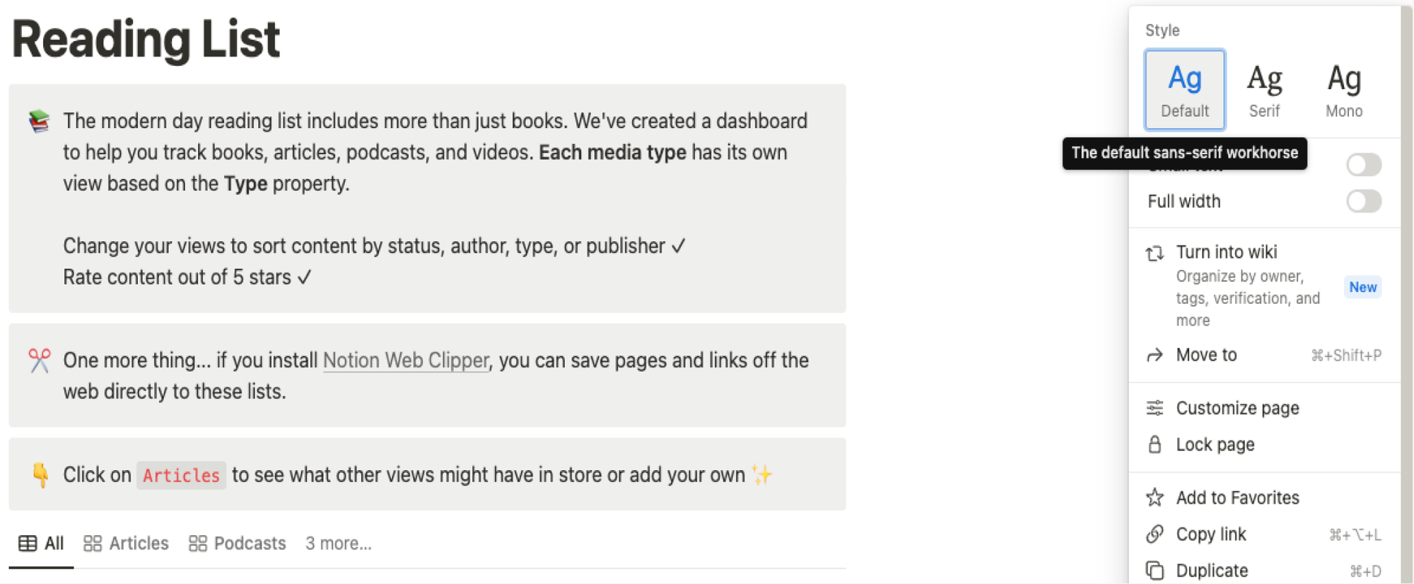
Notion lets people switch the typeface in one step. Its page style menu offers a default, a serif, and a mono style. That was our model for keeping the choice simple.
Personas and empathy map
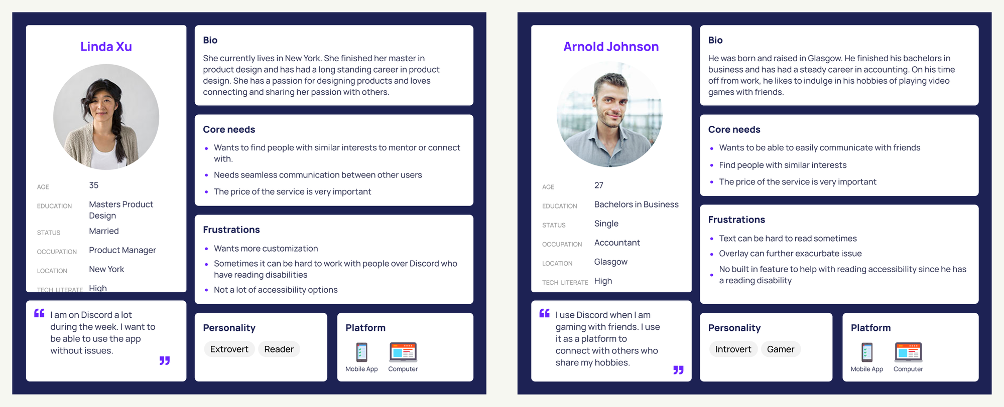
We built two personas: someone who uses Discord casually for networking, and a dedicated gamer who relies on it daily to stay in touch with friends. Both wanted more accessibility and customization.
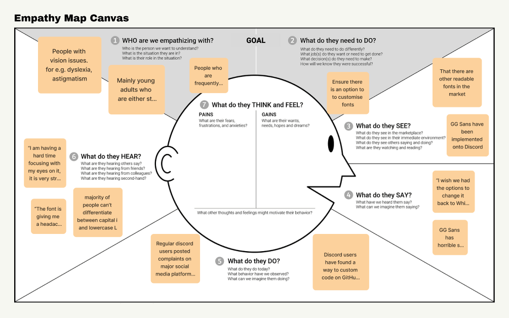
An empathy map helped teammates who were less familiar with these issues see what the experience is like.
Design
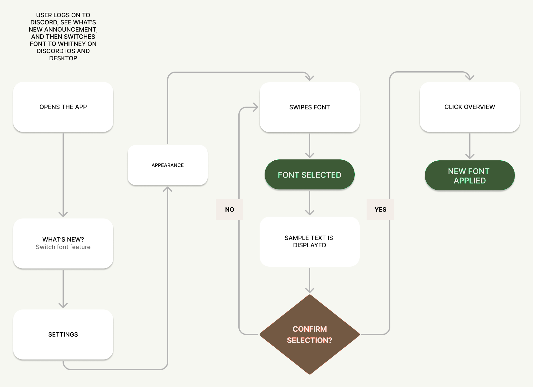
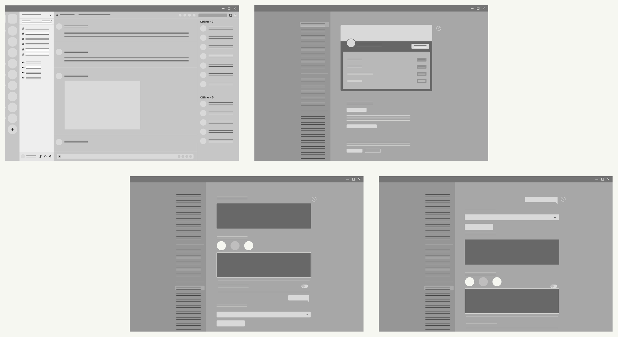
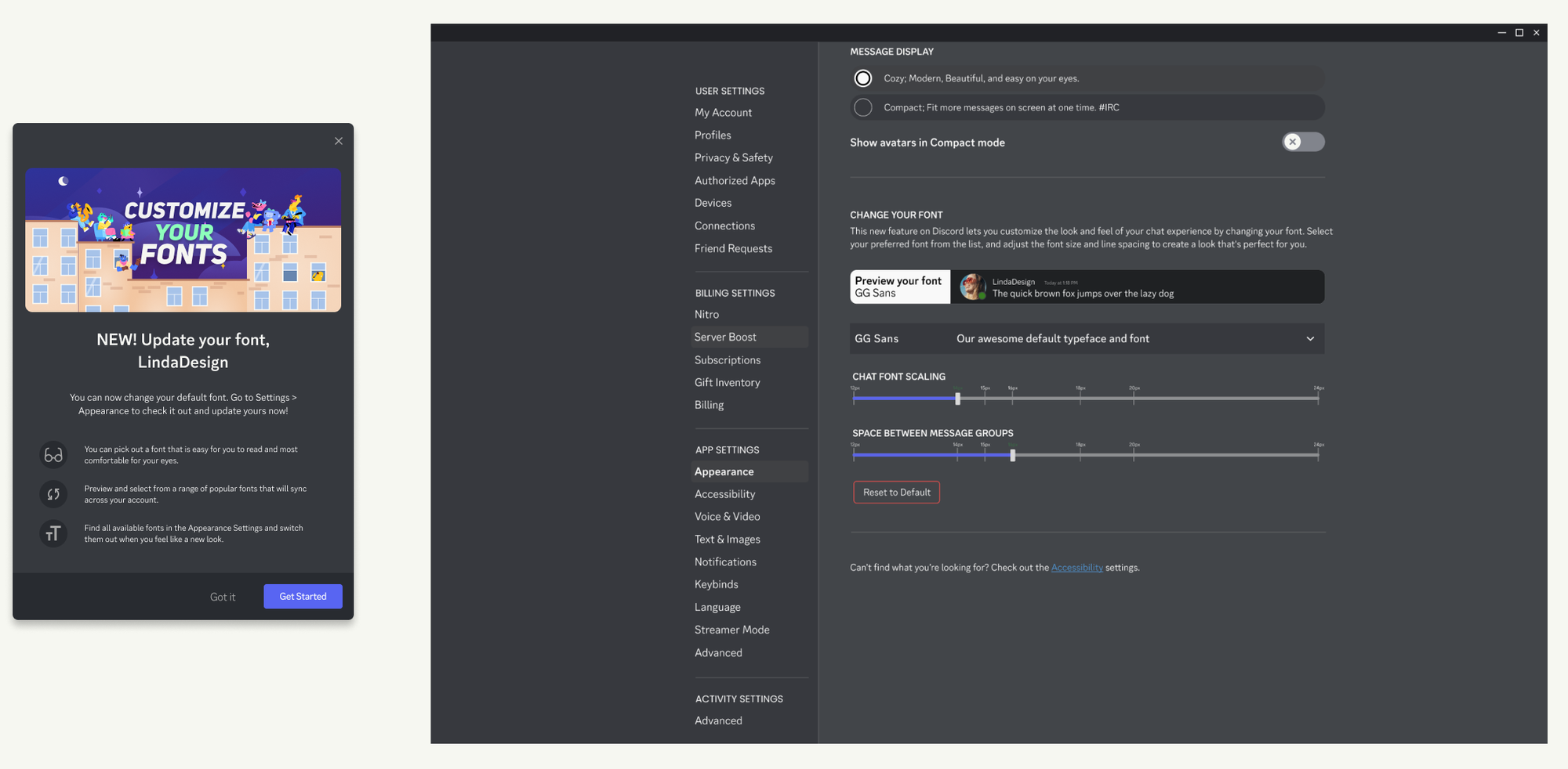
From the research I mapped a user flow for choosing a font in the client's settings: open the app, see the What's New announcement, go to Appearance, pick a font, check the sample text, and confirm. Then I sketched low-fidelity screens to refine the flow, and built a high-fidelity version with a popup that introduces the feature, alongside Discord's standard update banner.
In testing, people found the feature easily from the settings tab and found it simple to use.
What I learned
Pivoting. Our first plan let people upload their own fonts from their computers. That would have meant a lot of work for engineers and could have raised problems with Discord's terms of service, so we pivoted to a small set of default fonts, each chosen to help with a different visual impairment. We were selective: the fonts had to help people read and still look good.
Where it stands. We ran out of time, so we wrapped up after a final round of testing. With more time I'd test with more people and explore other designs. I'd also like to share the concept with Discord.